


The wonderful people over at Moxie Fab World and given us yet another awesome challenge...fanatical about botanical! Cath is trying to get us thinking in a whole nother direction when it comes to the trendy botanicals. We see the beautiful botanical theme everywhere but if you’re like me, when you use botanicals in your card making it usually ends up more on the whimsical side. Making a botanical themed card that IS NOT whimsical…now that’s a challenge!
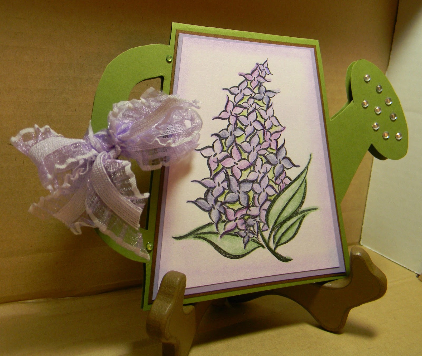
Isn’t it funny when you have an idea in your head, but when you sit down to sketch it out or to make the card, your run in a whole other direction? When I saw this challenge and gave it a good thought, I pictured a classic black and white card with an acetate overlay where I would place a pretty little rub on that I’ve been hording and maybe attach it with a pretty ribbon. When looking for the stamp that matches the rub on that I wanted to use, I pulled out several other “floral” stamps…they just called to me, I had to switch gears…I ended up making 2 separate cards that were NOTHING like my vision.


Items Used:
Color: Roseart colored pencils, Stampin Up lavender Lace chalk
Stamp: DeNami Design #P75 Lilac
Bling: The Paper Studio
Ribbon: Hobby Lobby
Other: Gamsol
Cardstock: green, chocolate, purple, white
Pattern: May 2008 Card Maker Magazine
Please check out my other card and that of the awesome folks over at Moxie Fab World!
Please leave me a comment and let me know what you think....good or bad....or even better - what would you have done differently??...crafty minds wanna know!